
Game Golf Digital Experience
Game Golf Digital Experience
Client
Game Golf
Services
UX/UI Design
Industory
Technology
Sport
Year
2019
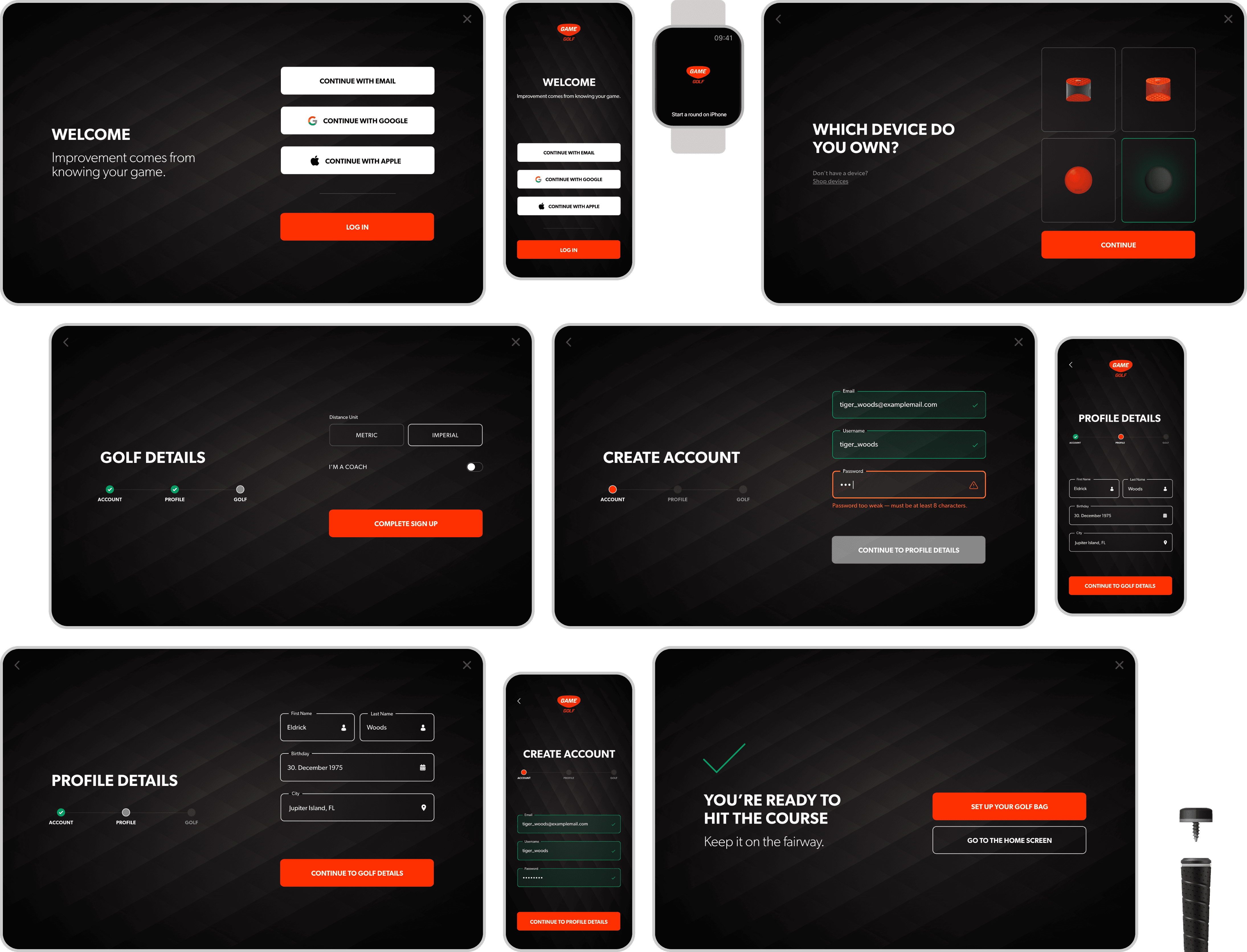
We were approached by Game Golf™ to help them build a digital experience for their award-winning sports products, used by President Obama among others. This encompasses creating a companion mobile app, along with a website, and a smart watch app.

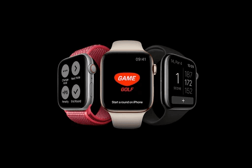

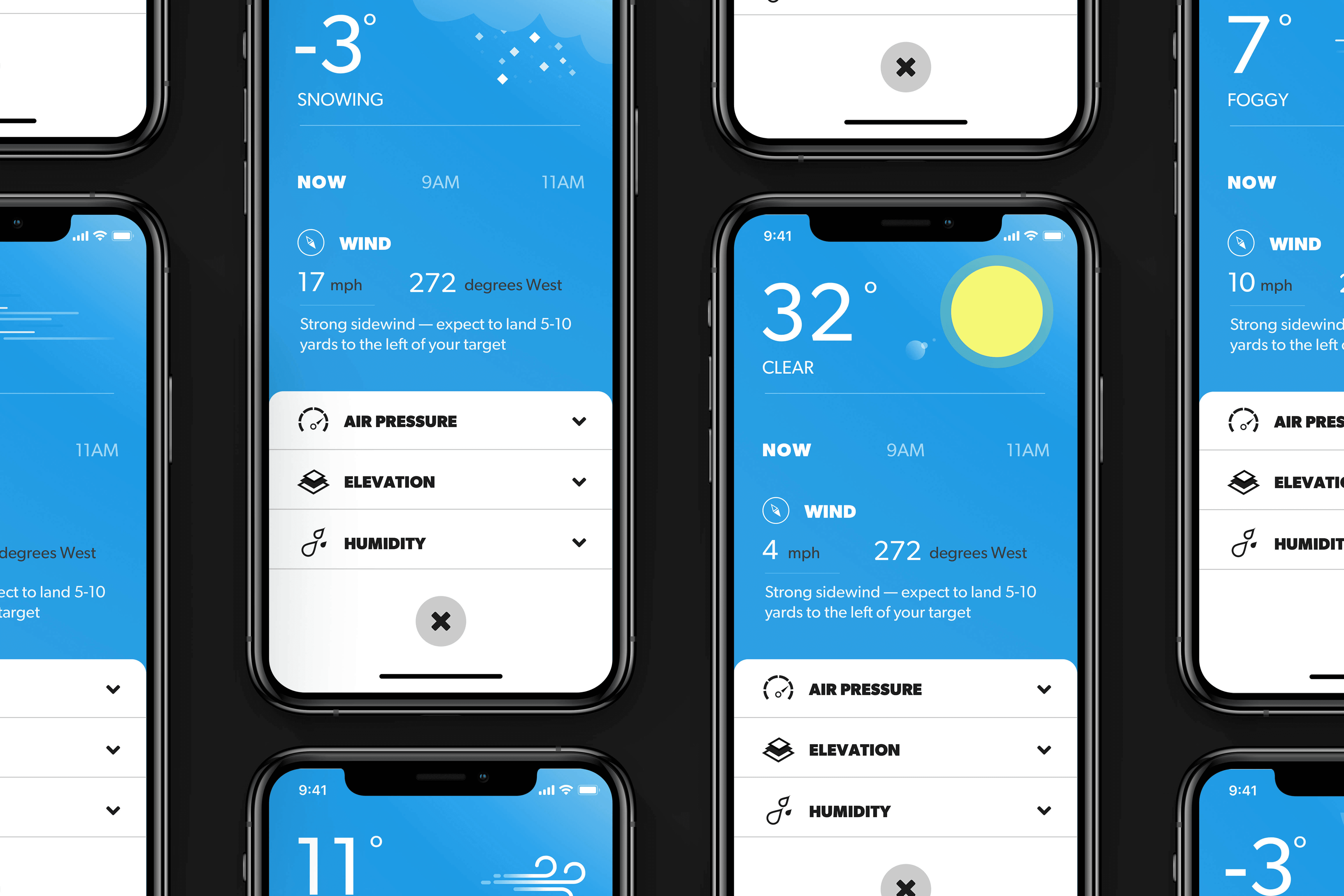


Overview | Game Golf is a digital application and physical device you connect to your golf gear. It provides accurate GPS Shot Tracker, designed to help you shoot lower scores. It tracks every shot, yardage and club hit, even giving you recommendations as you play. Its sensors allow for fully automatic shot detection to play with absolute freedom. | |
 | ||
Creating a Holistic Digital Experience for Every Golfer | How might we create an effortless and cohesive digital experience across mobile, web, and watch platforms that seamlessly supports a new line of hardware products? By addressing gaps in hardware integration, eliminating dead ends in the user journey, improving interaction intuitiveness, and increasing brand visibility, we aim to deliver a connected ecosystem for both professional and amateur golfers worldwide, helping them improve their performance and achieve better scores. | |
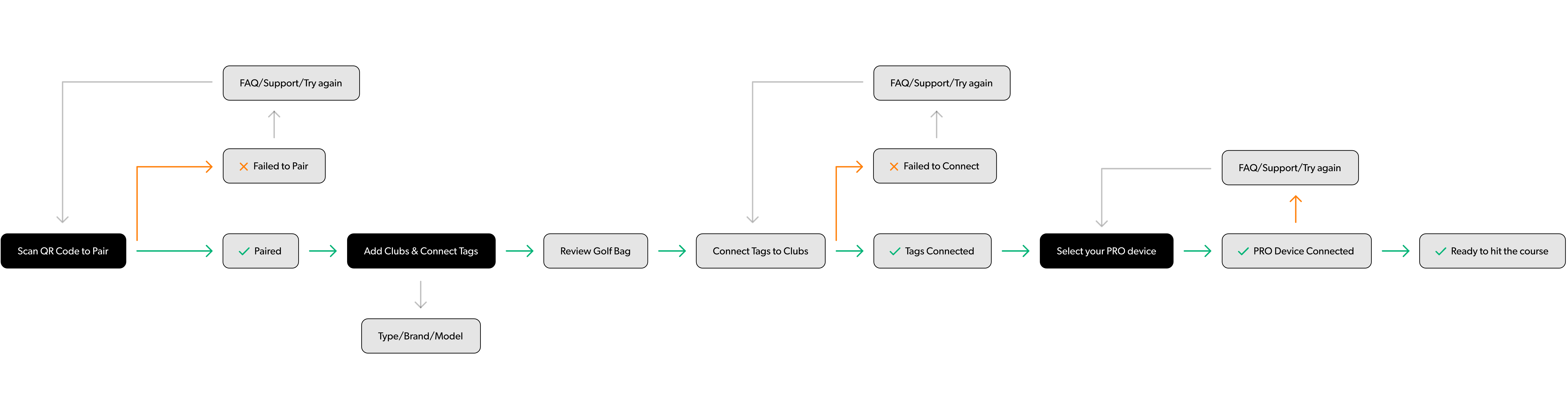 | ||
Setting up the devices | A key challenge in the brief was that the new line of devices would require the user to pair all 14 tags manually one-by-one through the app. This would add implications to the current onboarding flow, so a new flow was created from the ground up to accommodate the new devices and preserve backwards compatibility for older devices. | |
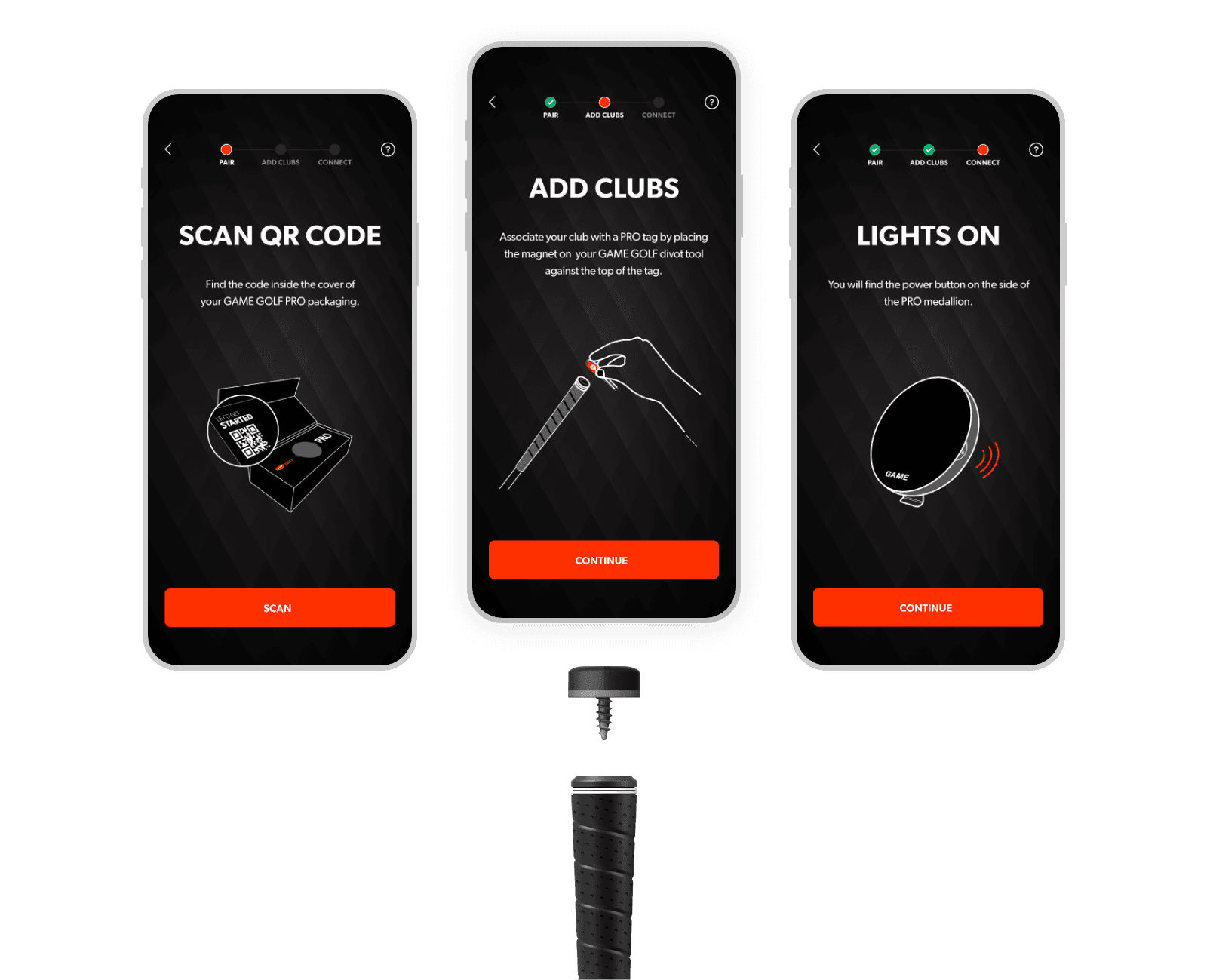 | Simple multi-step setupTo ensure an easy to understand and simple setup experience, we distilled the setup flow into only 3 parts - Pair, Add clubs and Connect. With the help of the GD team, we also created custom illustrations that portray each step's physical touchpoint. The intention is to prepare the user for what the next step is about. |
Clearly guiding the userWe knew from the get-go that we only had one chance to make sure the user is left with a good first impression(experience). So we aimed to make the pairing experience between hardware and software as humanly and close to real life as possible — through thoughtful copy and as little cognitive load as possible. | 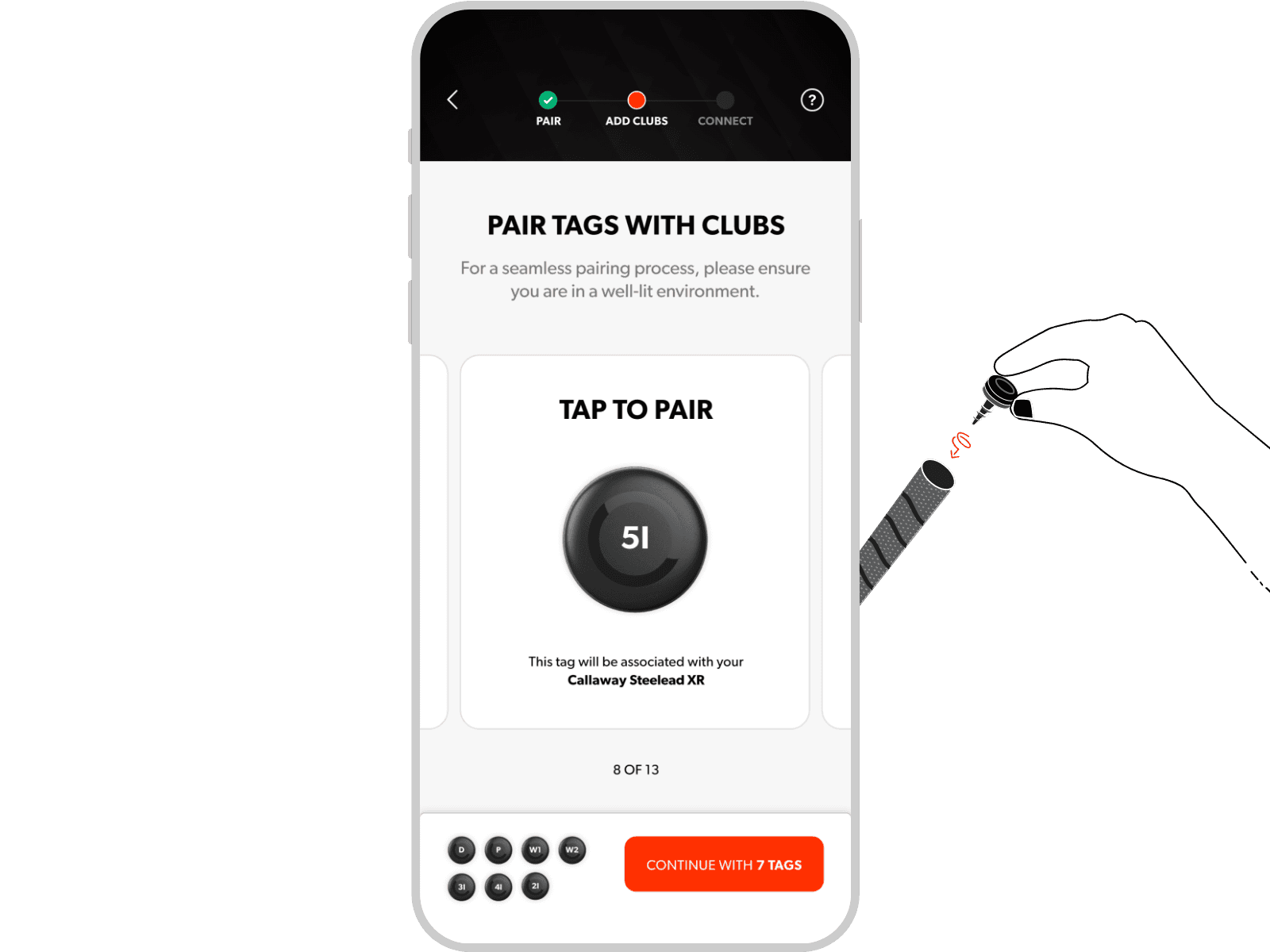 |
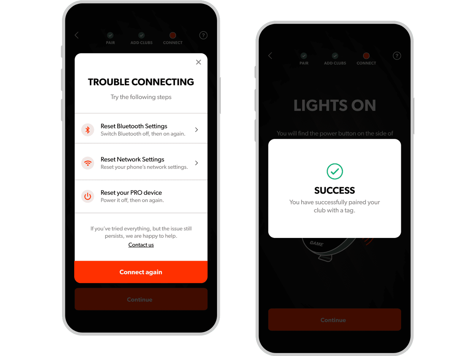 | Always holding the user’s handWe designed for a supportive experience at all times. We did that through adding a sense of state per user executed action (e.g. success/error snackbars), pinned help buttons on all screens, error states, followed by guidance via resolution paths. |
 | ||
Consistent and Meaningful User Interactions | To create a more intuitive experience, we focused on both contextual validation and interaction consistency. Rather than forcing users to discover errors only after attempting to continue, form fields provide immediate feedback as information is entered. At the same time, we addressed a common pain point identified in user interviews: the inconsistency of performing similar actions across different parts of the software. By introducing a unified set of visual interactions as part of a new style guide, we established a more predictable, meaningful, and brand-aligned experience throughout the product. | |
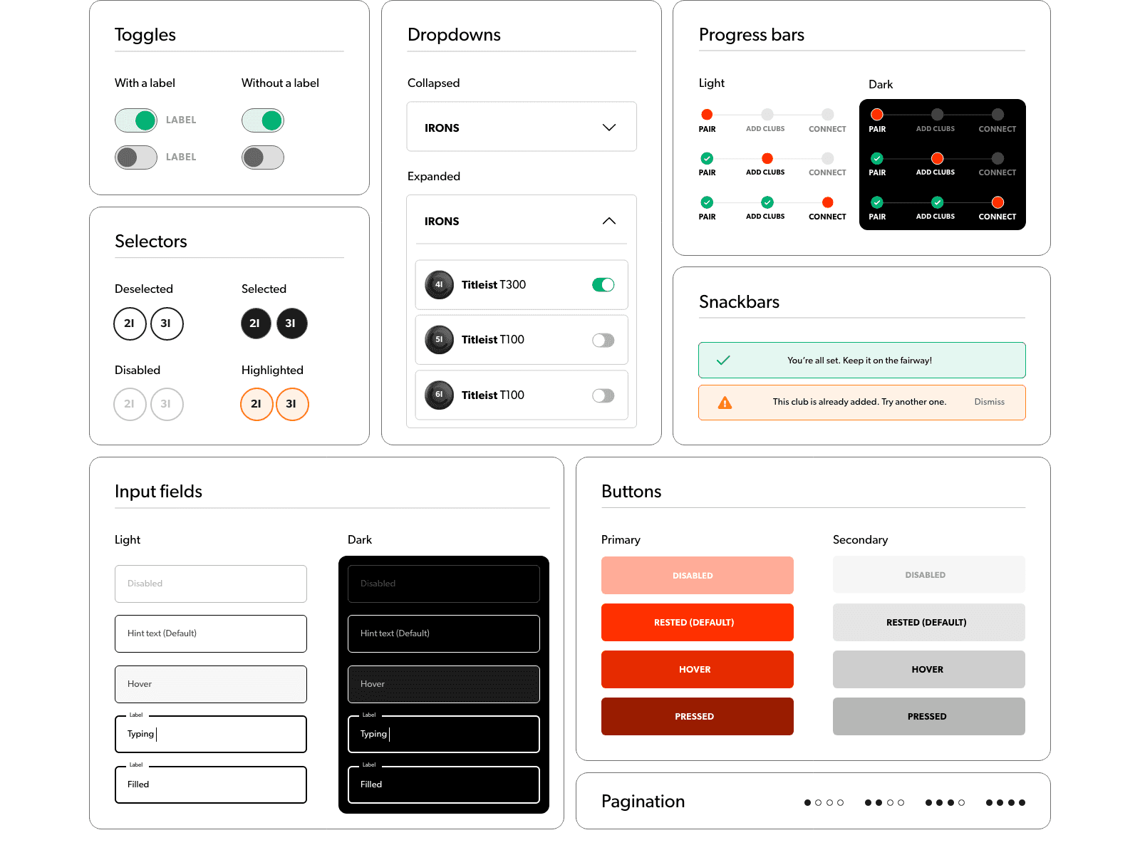 | ||
A common style guide | To ensure continuity across app and web, we created a set of components that align with the company's brand guidelines. This way we increased dev and design team's collaboration efficiency and set the ground for a minimal (if any) tech debt. | |
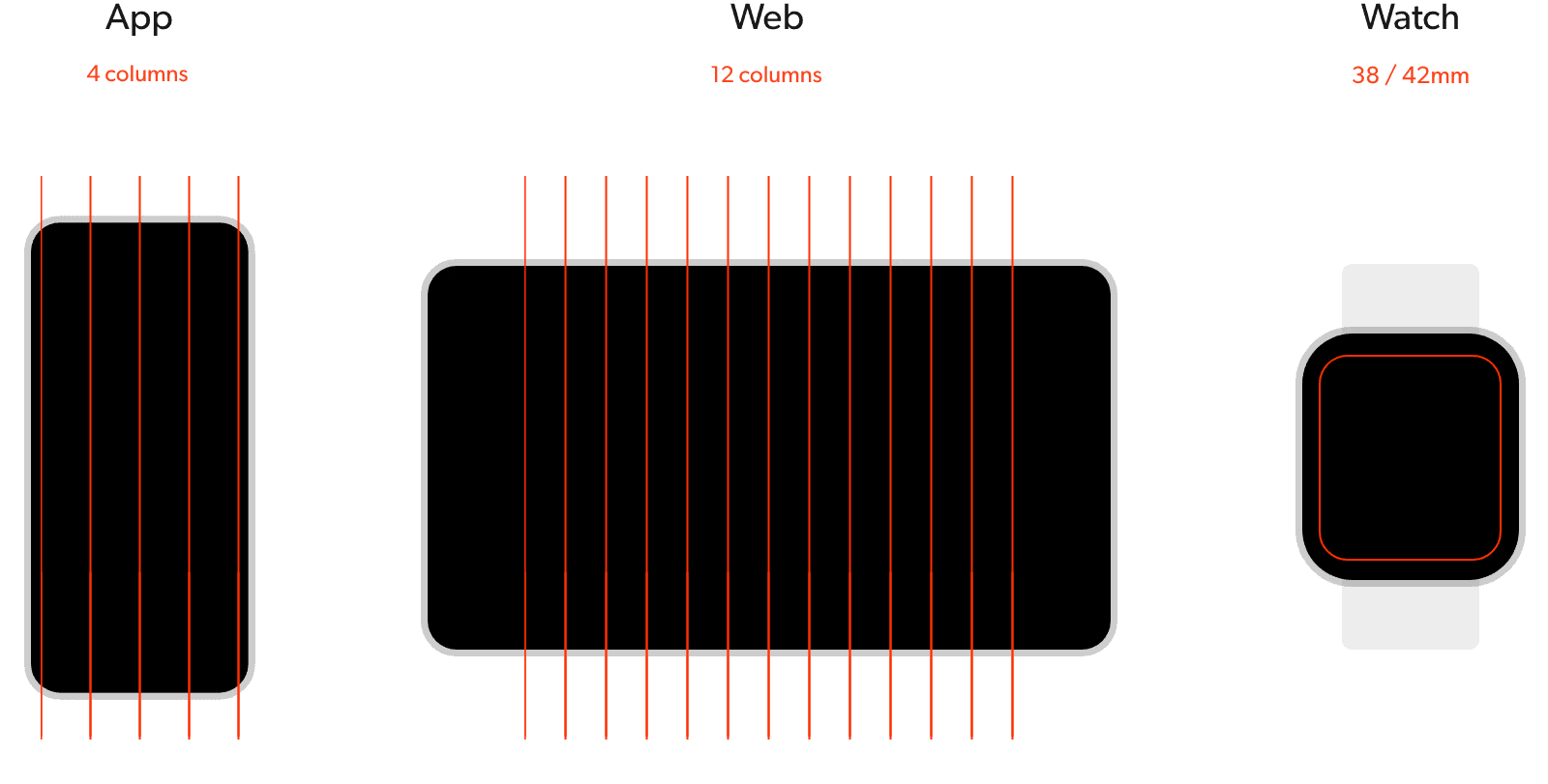 | ||
A scalable layout grid | For a consistent exprience across different platforms, we set up a few layout principles from the get-go. E.g. using an 8pt grid system across. Moreover, to accommodate the designs for both iOS, Android and Watch screen sizes, we used common practices from Apple's iOS & WatchOS HIG and Google's Material guidelines. | |
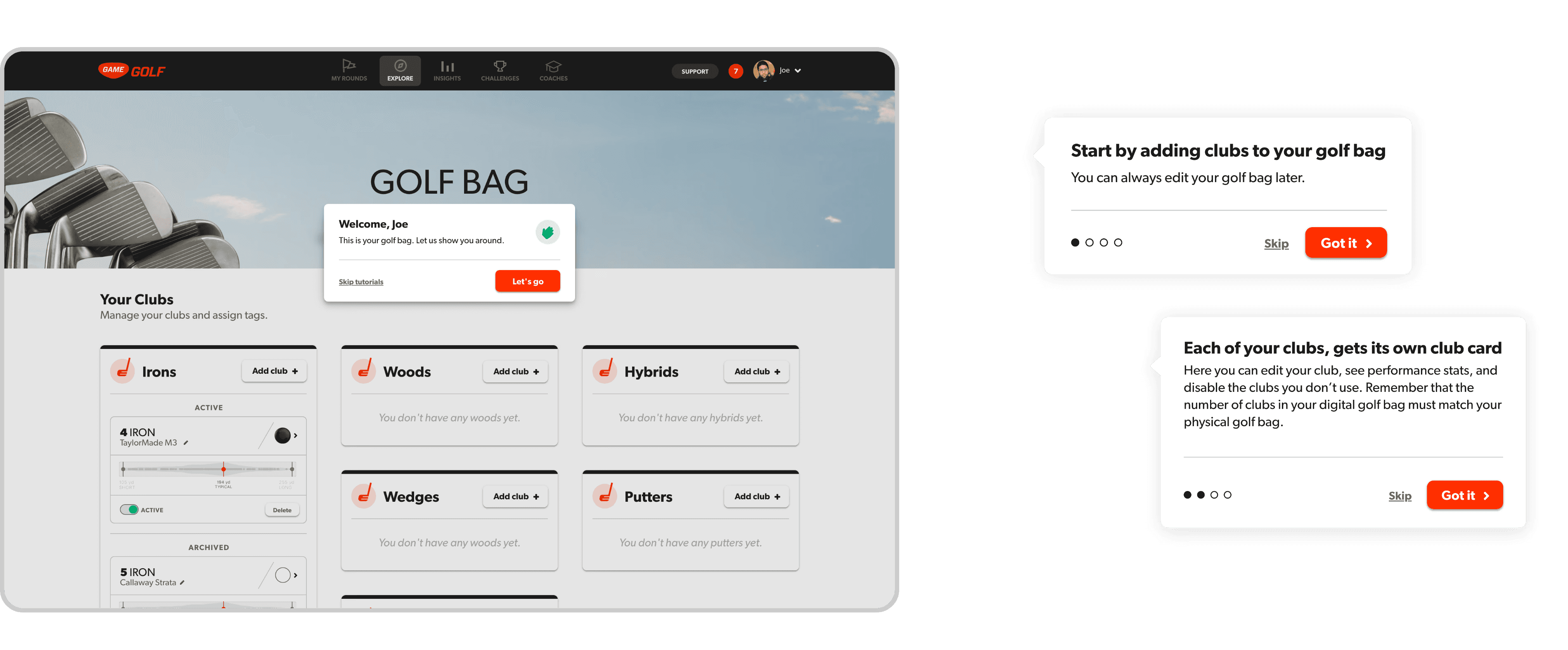 | ||
Welcome Tutorials | After completing signing up on the web, we wanted to create an easy transition to the product for new users. To do so, we created a set of quick tutorials, aimed to get the user started by highlighting the key areas of the page. | |
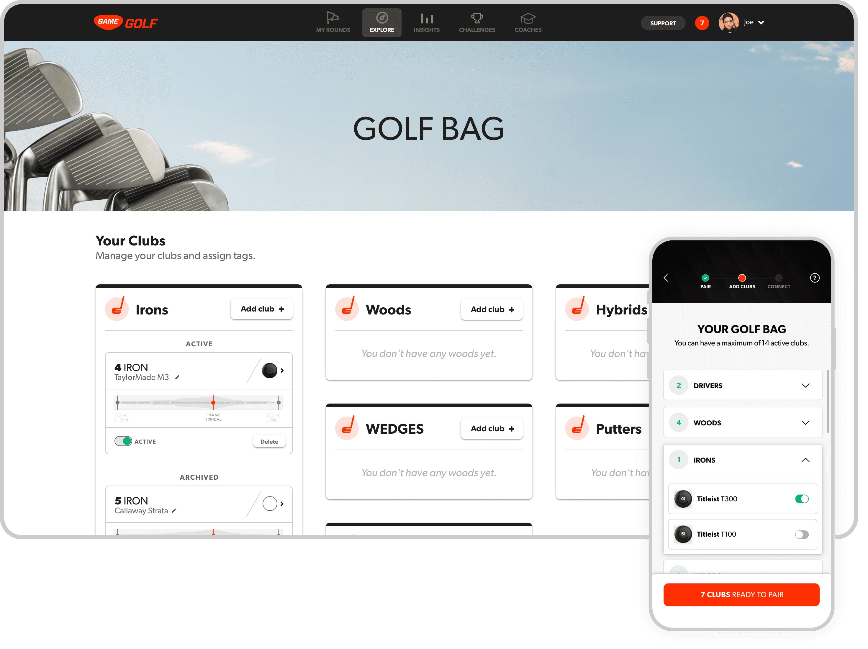 | Easy overview of paired clubsThe 'Golf bag' page is the place for users to get an overview of their paired devices, add new ones or re-assign the ones they don't use anymore. |
Adding clubs is how users link their clubs to their Game Golf devices.An interesting challenge was that the new line of devices from Game Golf (PRO) could only be linked on the app. To address that, we added an informative page in the web user journey, to guide the user to finish the action on the app. | 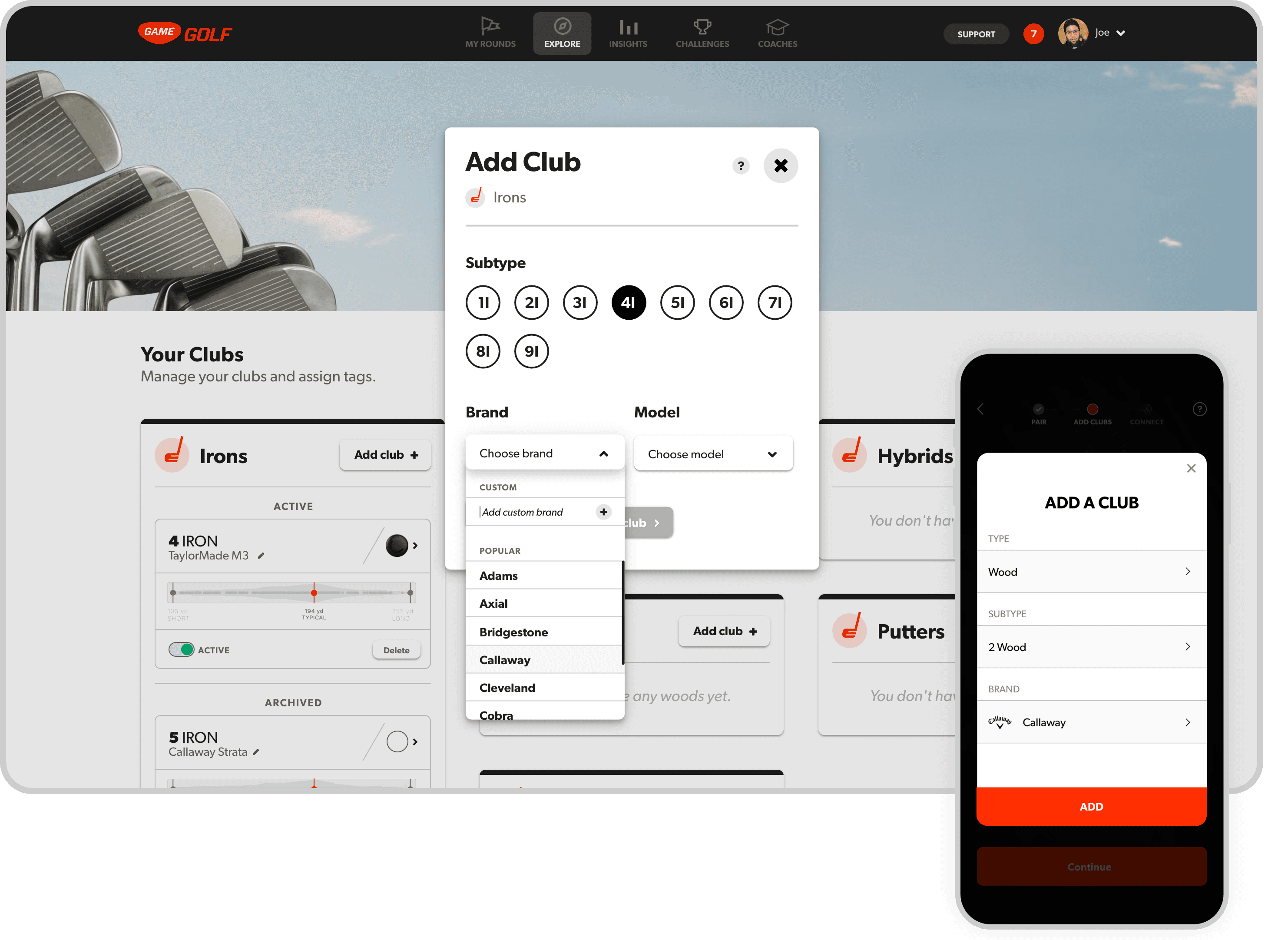 |
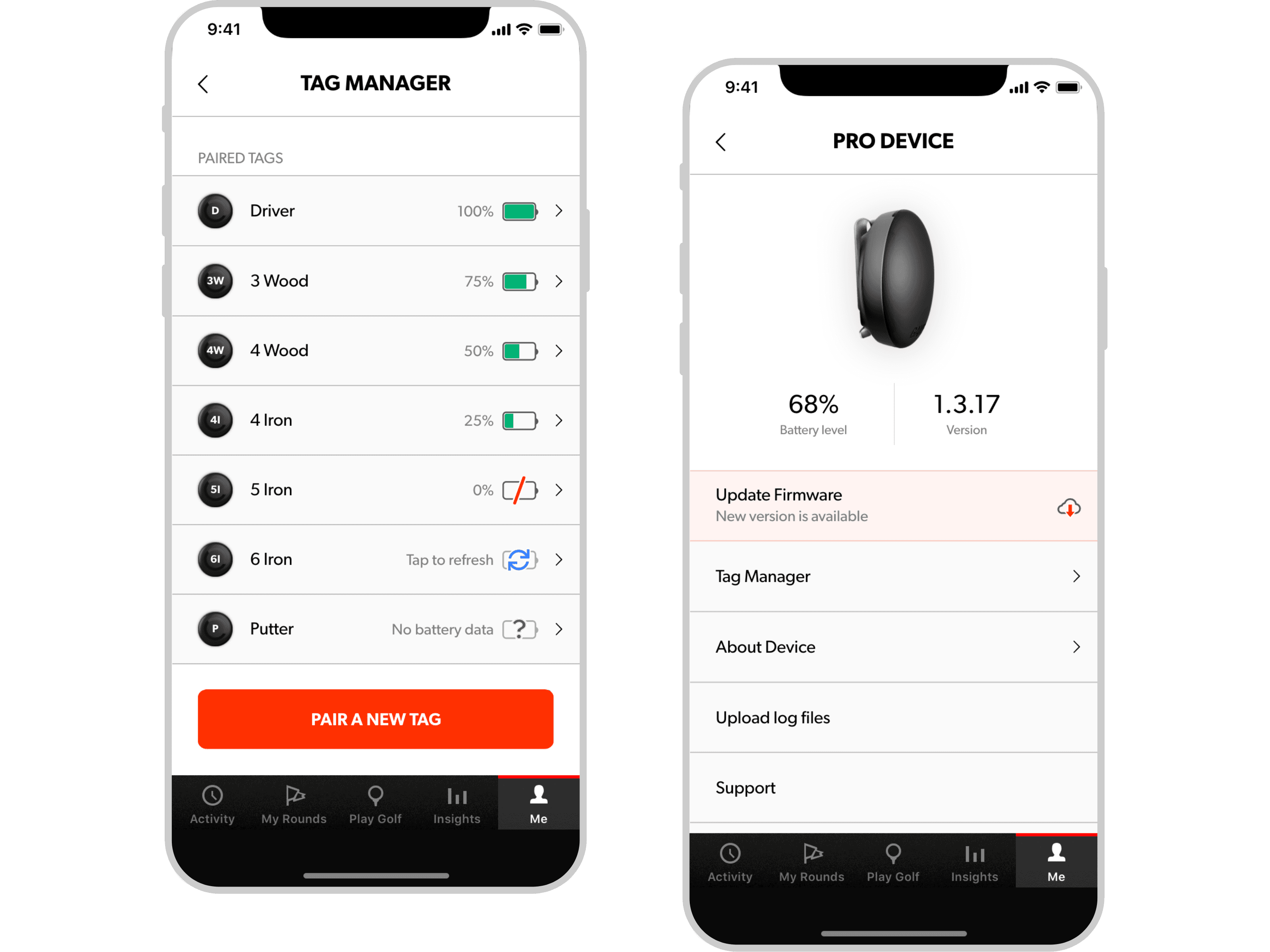 | Devices managementIn the app, we created devices management pages to help the user navigate through pairing, removing or updating devices. |


